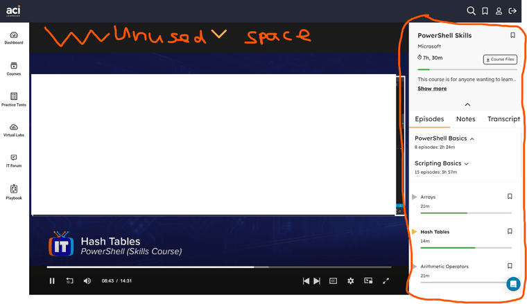
Feature request: Hide right navbar (lesson and course info)
-

Hi can you guys add a Hide button to that big thing on the right. I rarely ever need to look at it, if at all since I just watch and then click to watch the next episode.
It's really distracting, that big block of interface while Im trying to focus on the video, with my code app on the right of the video. You can hide the lesson navbar on Udemy btw.
-
JTLYK there's useful notes in there. It's not just a video list. You can click notes and review what is covered and theres also a transcript on the 3rd tab. (I didn't know til last week)
-
Oh I see the notes in there too, I just want to hide this because its very large and really is in my way trying to just focus on the video and the code. The information in the navbar is distracting and it should be easy to add a hide button
-
@devteam Please. Fundamental issue , easy to fix.
-
Please submit this to member services as a feature or change request via the chat bubble on our site. This is where to address platform issues and changes as such. The forums are really content driven. Glad you posted it but the Edutainers are not developers and the chat bubble is our official changes to do feature requests.
-
Thanks for the constructive criticism, @Chris-Spencer
In the mean time, would putting the video in full-screen be a sufficient workaround for you?